20";display:block;height:0;clear:both;visibility:hidden}.clearfix:before,.clearfix:after{content:' 20';display:block;overflow:hidden;visibility:hidden;width:0;height:0}.clearfix:after{clear:both}#Content .fixed-nav{display:none}.fixed-nav{position:fixed;bottom:40px;height:80px;z-index:90}.fixed-nav.fixed-nav-prev{left:0}.fixed-nav.fixed-nav-next{right:0}.fixed-nav .arrow{display:block;width:35px;height:80px;font-size:15px;position:relative;z-index:92;color:#fff;line-height:80px;text-align:center}.fixed-nav .photo{height:80px;width:80px;position:relative;z-index:92;overflow:hidden;line-height:0;background-color:#eee}.fixed-nav .desc{width:190px;padding:6px 15px;min-height:68px;background:#fff;z-index:91}.fixed-nav .desc h6{margin-bottom:0}.fixed-nav .desc i{display:inline-block;margin-right:2px}.fixed-nav .desc i:before{margin-left:0}.fixed-nav .desc .date{display:inline-block;width:100%;padding-top:3px;border-top-width:1px;border-top-style:solid}.fixed-nav-prev .arrow,.fixed-nav-prev .photo,.fixed-nav-prev .desc{float:left}.fixed-nav-prev .desc{margin-left:-335px}.fixed-nav-next .arrow,.fixed-nav-next .photo,.fixed-nav-next .desc{float:right}.fixed-nav-next .desc{margin-right:-335px}@media only screen and (max-width:1430px){.fixed-nav-prev .photo{position:static;margin-left:-115px}.fixed-nav-next .photo{position:static;margin-right:-115px}}#Header_wrapper{position:relative}body:not(.template-slider) #Header_wrapper{background-repeat:no-repeat;background-position:top center}#Header{position:relative}body:not(.template-slider) #Header{min-height:250px}#Header .container{padding-left:var(--mfn-column-gap-left);padding-right:var(--mfn-column-gap-right);box-sizing:border-box}#Top_bar{position:absolute;left:0;top:61px;width:100%;border-bottom:1px solid transparent;z-index:30}#Top_bar .column{display:flex;margin-bottom:0}.layout-full-width.header-fw #Top_bar .container{max-width:100%}.layout-full-width.header-fw #Top_bar .container{padding-left:0;padding-right:0}#Top_bar .top_bar_left{position:relative;float:left;width:100%}#Top_bar .logo{float:left;margin:0 30px 0 20px}#Top_bar #logo{display:block;height:60px;line-height:60px;padding:15px 0;box-sizing:content-box}#Top_bar #logo img{vertical-align:middle;max-height:100%}#Top_bar #logo img.logo-sticky,#Top_bar #logo img.logo-mobile,#Top_bar #logo img.logo-mobile-sticky{display:none}#Top_bar .menu_wrapper{float:left;z-index:201}#Top_bar .secondary_menu_wrapper{display:none}#Top_bar a.responsive-menu-toggle{display:none;position:absolute;right:15px;top:50%;margin-top:-17px;width:34px;height:34px;text-align:center;border-radius:3px;z-index:200}#Top_bar a.responsive-menu-toggle i{font-size:22px;line-height:34px}#Top_bar .search_wrapper{position:absolute;left:50%;transform:translateX(-50%);top:calc(100% + 40px);display:none;z-index:205;width:100%;box-sizing:border-box;width:600px;max-width:80%;overflow:hidden}#Top_bar .search_wrapper>form{position:relative}#Top_bar .search_wrapper input[type=text]{width:100%;margin:0;box-sizing:border-box;-webkit-box-shadow:0 0 0;box-shadow:0 0 0;padding:22px 30px 22px 60px;background:0 0;border-width:0;font-size:15px;color:rgba(0,0,0,.8)}#Top_bar .search_wrapper .icon_search,#Top_bar .search_wrapper .icon_close{position:absolute;top:50%;transform:translateY(-50%)}#Top_bar .search_wrapper .icon_search{left:15px}#Top_bar .search_wrapper .icon_close{right:10px}#Top_bar .search_wrapper{background-color:#fff;box-shadow:0px 10px 46px 0px rgba(1,7,39,.1);border-radius:4px}#Top_bar #menu{z-index:201}#Top_bar .menu{z-index:202}#Top_bar .menu.menu-mobile{display:none}#Top_bar .menu>li{margin:0;z-index:203;display:block;float:left}#Top_bar .menu>li:not(.mfn-megamenu-parent){position:relative}#Top_bar .menu>li>a{display:block;line-height:60px;padding:15px 0;position:relative}#Top_bar .menu>li>a:not(.menu-toggle):after{content:"";height:4px;width:100%;position:absolute;left:0;top:-4px;z-index:203;opacity:0}#Top_bar .menu>li>a span:not(.description){display:block;line-height:60px;padding:0 20px;white-space:nowrap;border-right-width:1px;border-style:solid}#Top_bar .menu>li:last-child>a span{border:0}#Top_bar .menu>li.current-menu-item>a:after{opacity:1}#Top_bar .menu li ul{position:absolute;left:0;top:100%;z-index:205;margin:0;display:none;background-image:url(/wp-content/themes/betheme/images/box_shadow.png);background-repeat:repeat-x;background-position:left top}#Top_bar .menu li>ul{box-shadow:2px 2px 2px 0 rgba(0,0,0,.03);-webkit-box-shadow:2px 2px 2px 0 rgba(0,0,0,.03)}#Top_bar .menu li ul li{padding:0;width:200px;position:relative;font-weight:400}#Top_bar .menu li ul li a{padding:10px 20px;display:block;border-bottom:1px solid rgba(0,0,0,.05)}#Top_bar .menu li ul li a span{display:inline-block;position:relative}.header-classic #Header .top_bar_left{background-color:transparent}.header-classic #Top_bar{position:static;background-color:#fff}#body_overlay{position:fixed;top:0;left:0;width:100%;height:120%;background:rgba(0,0,0,.6);z-index:9002;display:none}body.mobile-side-slide{position:relative;overflow-x:visible}#Side_slide{display:block;position:fixed;top:0;right:-250px;max-width:100%;width:250px;height:100%;overflow:auto;border-bottom-width:60px;border-bottom-style:solid;z-index:99999;z-index:100000}#Side_slide .close-wrapper{height:60px}#Side_slide .close-wrapper a.close{height:34px;width:34px;display:block;float:right;margin:13px 13px 0 0}#Side_slide .close-wrapper a.close i{font-size:22px;line-height:34px}#Side_slide .extras{padding:0 20px}#Side_slide .extras .extras-wrapper{display:flex;align-items:center;flex-wrap:wrap;justify-content:center;margin-bottom:20px}#Side_slide .lang-wrapper{margin-bottom:20px;text-align:center;display:none}#Side_slide .social{text-align:center;margin:0 20px 13px}#Side_slide .social li{display:inline-block}#Side_slide .social li a{display:block;padding:3px 5px;text-decoration:none}#Side_slide{background-color:#191919;border-color:#191919}#Side_slide,#Side_slide a:not(.action_button){color:#a6a6a6}.post-meta{margin-bottom:8px}.post-meta .author-date{float:left}.post-meta .category{float:right;position:relative}.post-meta .category.mata-tags{margin-right:10px}.post-meta .category .cat-wrapper{position:absolute;right:0;top:100%;display:none;z-index:21}.post-meta .category .cat-wrapper ul{padding:7px;min-width:70px;background:#f9f9f9}.post-meta .category .cat-wrapper ul li{border-bottom:1px solid rgba(0,0,0,.05)}.post-meta .category .cat-wrapper ul li:last-child{border-bottom:0}.post-meta .category .cat-wrapper ul li a{display:block;text-align:center;padding:1px 5px;color:#8b8b8b}.post-nav{padding:10px 15px 4px 130px;margin-bottom:20px;background-image:url(/wp-content/themes/betheme/images/stripes/stripes_5_b.png);-webkit-box-sizing:border-box;-moz-box-sizing:border-box;box-sizing:border-box;overflow:hidden}.post-nav .next-prev-nav{float:left}.post-nav .next-prev-nav li{float:left;margin-right:5px}.post-nav .next-prev-nav a.button{margin:0}.post-nav .list-nav{float:right;line-height:49px}.share-simple .post-nav{padding-left:15px;padding-right:15px}a.mfn-love:not(.loved) i:last-child{display:none}.post-header{margin-bottom:20px}.post-header .title_wrapper{margin-left:99px;border-left-width:1px;border-style:solid;padding-left:30px}.single-photo-wrapper .image_frame{margin-left:120px}.share-simple .single-photo-wrapper .image_frame{margin-left:0}.single-photo-wrapper.image{text-align:center}.single-photo-wrapper.image .image_frame{margin-left:0;display:inline-block}.section-post-header .single-photo-wrapper.image .image_frame{max-width:80%;max-width:calc(100% - 130px)}.share-simple .section-post-header .single-photo-wrapper.image .image_frame{max-width:100%}.section-post-related .post-related hr{margin-left:30px;width:40%}.section-post-related .simple .post-related hr{display:none}.share-simple .post-header .title_wrapper{margin-left:0;padding-left:0;border-left-width:0}.share-simple-wrapper .mfn-love i{position:absolute;left:0;top:0;font-size:16px}.share-simple-wrapper .mfn-love i:last-child{opacity:0}.dark{color:#fff!important}.image_frame{display:block;overflow:hidden;margin:0;border-style:solid;border-width:0;max-width:100%;line-height:0;box-sizing:border-box}.image_frame .image_wrapper{box-sizing:border-box}.image_frame .image_wrapper{position:relative;overflow:hidden}.image_frame .image_wrapper img:not(.ls-l){position:relative;top:0;-webkit-transform:scale(1);-moz-transform:scale(1);-o-transform:scale(1);transform:scale(1)}hr{display:block;border:none;outline:none;height:1px;width:100%;margin:0 auto 15px;clear:both}hr{margin:0 auto 15px;clear:both}form{margin-bottom:0}input[type=text]{padding:10px;outline:none;margin:0;width:230px;max-width:100%;display:block;margin-bottom:20px;font-size:15px;border-width:1px;border-style:solid;border-radius:0;box-sizing:border-box;-webkit-appearance:none}ul{list-style:none outside}input[type=text],.post-header .title_wrapper,.fixed-nav .desc .date{border-color:rgba(0,0,0,.08)}input[type=text]{background-color:#fff;color:#626262;box-shadow:inset 0 0 2px 2px rgba(0,0,0,.02)}hr{background-color:rgba(0,0,0,.08);color:rgba(0,0,0,.08)}#Top_bar .menu>li>a span{border-color:rgba(0,0,0,.05)}.image_frame{border-color:#f8f8f8}.image_frame .image_wrapper{border-color:#e2e2e2}.mfn-close-icon{z-index:5;display:flex;justify-content:center;align-items:center;width:40px;height:40px;font-size:20px;text-decoration:none!important}.mfn-close-icon .icon{color:rgba(0,0,0,.3);display:inline-block}.section_wrapper{display:flex;align-items:flex-start;flex-wrap:wrap}body{--mfn-swiper-pagination-bullet-active-color:#007aff;--mfn-swiper-pagination-bullet-inactive-color:#000;--mfn-swiper-pagination-bullet-width:10px;--mfn-swiper-pagination-bullet-height:10px;--mfn-swiper-pagination-spacing:20px;--mfn-swiper-arrow-width:auto;--mfn-swiper-arrow-height:auto;--mfn-swiper-arrow-size:50px;--mfn-swiper-arrow-spacing:20px}body{--mfn-tabs-border-width:1px}html{overflow-x:hidden}@media only screen and (min-width:960px) and (max-width:1239px){body{min-width:0}#Wrapper{max-width:960px}.section_wrapper,.container{max-width:940px}}@media only screen and (max-width:959px){.section{background-attachment:scroll!important}}@media only screen and (min-width:768px) and (max-width:959px){body{min-width:0}#Wrapper{max-width:728px}.section_wrapper,.container{max-width:708px}}@media only screen and (max-width:767px){body{min-width:0}body.responsive-overflow-x-mobile{overflow-x:hidden}.section_wrapper .column,.container .column{margin:0;width:100%;clear:both}.sections_group{margin:0;width:100%!important;clear:both}.content_wrapper .section_wrapper,.container{max-width:700px!important}.content_wrapper .mcb-column-inner{margin:0 0 20px}body:not(.mobile-sticky) .header_placeholder{height:0!important}#Top_bar{background-color:#fff!important;position:static}#Top_bar .container{max-width:100%!important;padding:0!important}#Top_bar .column{flex-wrap:wrap}#Top_bar .top_bar_left{float:none;width:100%!important;background:none!important}#Top_bar a.responsive-menu-toggle{top:40px;right:10px}#Top_bar .menu_wrapper{float:left!important;width:100%;margin:0!important}#Top_bar #menu{float:left;position:static!important;width:100%!important}#Top_bar .logo{position:static;float:left;width:100%;text-align:center;margin:0}#Top_bar .logo #logo{padding:0!important;margin:10px 50px}#Top_bar #logo img.logo-main{display:none}#Top_bar #logo img.logo-mobile{display:inline-block}#Top_bar #logo img.logo-mobile-sticky{display:none}#Top_bar .search_wrapper{z-index:10000}.mobile-menu #Top_bar .menu.menu-main{display:none}.mobile-menu #Top_bar .menu.menu-mobile{display:block}.mobile-header-mini #Top_bar{top:0}.mobile-header-mini #Top_bar .container{max-width:100%!important}.mobile-header-mini #Top_bar .top_bar_left{float:left;position:static}.mobile-header-mini #Top_bar .logo{width:auto;float:left;margin-left:15px;border:none}.mobile-header-mini #Top_bar #logo{height:60px!important;line-height:60px!important;margin:0}.mobile-header-mini #Top_bar a.responsive-menu-toggle{top:30px!important;left:auto;right:10px;margin-top:-17px}.mobile-header-mini #Top_bar #menu{padding-bottom:10px}.mobile-header-mini #Top_bar #menu ul li a span{line-height:44px}.post-header .title_wrapper{margin-left:69px;padding-left:20px}.post-header .post-meta .category{display:none}.single-photo-wrapper .image_frame{max-width:100%!important;margin-left:0}.post-nav{padding:10px 10px 4px 90px}.image_frame{margin-top:0!important}.fixed-nav{display:none!important}}@media only screen and (max-width:479px){.post-nav{padding:10px 10px 4px}}html{background-color:#fcfcfc}#Wrapper,#Content,#Top_bar .search_wrapper{background-color:#fcfcfc}body:not(.template-slider) #Header{min-height:0px}body,input[type=submit],input[type=text]{font-family:"Avenir Light",-apple-system,BlinkMacSystemFont,"Segoe UI",Roboto,Oxygen-Sans,Ubuntu,Cantarell,"Helvetica Neue",sans-serif}#menu>ul>li>a{font-family:"Avenir Light",-apple-system,BlinkMacSystemFont,"Segoe UI",Roboto,Oxygen-Sans,Ubuntu,Cantarell,"Helvetica Neue",sans-serif}h6{font-family:"Tahoma",-apple-system,BlinkMacSystemFont,"Segoe UI",Roboto,Oxygen-Sans,Ubuntu,Cantarell,"Helvetica Neue",sans-serif}body{font-size:25px;line-height:29px;font-weight:400;letter-spacing:0px}#menu>ul>li>a{font-size:25px;font-weight:300;letter-spacing:0px}h6{font-size:14px;line-height:25px;font-weight:400;letter-spacing:0px}@media only screen and (min-width:768px) and (max-width:959px){body{font-size:21px;line-height:25px;font-weight:400;letter-spacing:0px}#menu>ul>li>a{font-size:21px;font-weight:300;letter-spacing:0px}h6{font-size:13px;line-height:21px;font-weight:400;letter-spacing:0px}}@media only screen and (min-width:480px) and (max-width:767px){body{font-size:19px;line-height:22px;font-weight:400;letter-spacing:0px}#menu>ul>li>a{font-size:19px;font-weight:300;letter-spacing:0px}h6{font-size:13px;line-height:19px;font-weight:400;letter-spacing:0px}}@media only screen and (max-width:479px){body{font-size:15px;line-height:19px;font-weight:400;letter-spacing:0px}#menu>ul>li>a{font-size:15px;font-weight:300;letter-spacing:0px}h6{font-size:13px;line-height:19px;font-weight:400;letter-spacing:0px}}@media only screen and (min-width:1240px){#Wrapper{max-width:1240px}.section_wrapper,.container{max-width:1220px}}@media only screen and (max-width:767px){#Wrapper{max-width:calc(100% - 67px)}.content_wrapper .section_wrapper,.container{max-width:550px!important;padding-left:33px;padding-right:33px}}.button-custom .button,.button-custom input[type=submit]{font-family:Roboto;font-size:24px;line-height:24px;font-weight:700;letter-spacing:0px;padding:12px 20px;border-width:0;border-radius:0;border-color:transparent}body.button-custom .button{color:#fff;background-color:#529bd4;border-color:transparent}.button-custom input[type=submit]{color:#fff;background-color:#0095eb;border-color:transparent;box-shadow:unset}#Top_bar #logo{height:60px;line-height:60px;padding:15px 0}#Top_bar .menu>li>a{padding:15px 0}@media only screen and (max-width:767px){.mobile-header-mini #Top_bar #logo{height:50px!important;line-height:50px!important;margin:5px 0}}.image_frame{border-width:0}#Side_slide{right:-250px;width:250px}@media only screen and (min-width:1240px){body:not(.header-simple) #Top_bar #menu{display:block!important}.menu-link-color #Top_bar .menu>li>a:not(.menu-toggle):after{display:none!important}}@media only screen and (min-width:768px) and (max-width:1240px){.header_placeholder{height:0!important}}@media only screen and (max-width:1239px){#Top_bar #menu{display:none;height:auto;width:300px;bottom:auto;top:100%;right:1px;position:absolute;margin:0}#Top_bar a.responsive-menu-toggle{display:block}#Top_bar #menu>ul{width:100%;float:left}#Top_bar #menu ul li{width:100%;padding-bottom:0;border-right:0;position:relative}#Top_bar #menu ul li a{padding:0 25px;margin:0;display:block;height:auto;line-height:normal;border:none}#Top_bar #menu ul li a:not(.menu-toggle):after{display:none}#Top_bar #menu ul li a span{border:none;line-height:44px;display:inline;padding:0}#Top_bar #menu ul li a span:after{display:none!important}#Top_bar #menu ul li ul{position:relative!important;left:0!important;top:0;padding:0;margin-left:0!important;width:auto!important;background-image:none!important;box-shadow:0 0 0 0 transparent!important;-webkit-box-shadow:0 0 0 0 transparent!important}#Top_bar #menu ul li ul li{width:100%!important}#Top_bar #menu ul li ul li a{padding:0 20px 0 35px}#Top_bar #menu ul li ul li a span{padding:0}#Top_bar #menu ul li ul li a span:after{display:none!important}#Header #menu>ul>li.current-menu-item>a{background:rgba(0,0,0,.02)}}body{--mfn-clients-tiles-hover:#529bd4;--mfn-icon-box-icon:#529bd4;--mfn-sliding-box-bg:#529bd4;--mfn-woo-body-color:#3f3f3f;--mfn-woo-heading-color:#3f3f3f;--mfn-woo-themecolor:#529bd4;--mfn-woo-bg-themecolor:#529bd4;--mfn-woo-border-themecolor:#529bd4}#Header_wrapper{background-color:#000119}body{color:#3f3f3f}.fixed-nav .arrow{background-color:#529bd4}a{color:#529bd4}.post-meta,.post-meta a,.fixed-nav .desc .date{color:#5d686e}h6{color:#3f3f3f}hr.hr_color{color:#529bd4;background:#529bd4}#Header .top_bar_left,.header-classic #Top_bar,#Top_bar #menu{background-color:#fff}#Top_bar .menu>li>a{color:#3f3f3f}#Top_bar .menu>li.current-menu-item>a{color:#529bd4}#Top_bar .menu>li a:not(.menu-toggle):after{background:#529bd4}#Top_bar .menu>li ul{background-color:#f2f2f2}#Top_bar .menu>li ul li a{color:#5f5f5f}#Top_bar .responsive-menu-toggle{color:#529bd4;background:0 0}#Side_slide{background-color:#191919;border-color:#191919}#Side_slide,#Side_slide a:not(.action_button){color:#a6a6a6}.image_frame{border-color:#f8f8f8}input[type=text]{color:#626262;background-color:rgba(255,255,255,1);border-color:#ebebeb}::-webkit-input-placeholder{color:#929292}::-moz-placeholder{color:#929292}:-ms-input-placeholder{color:#929292}:focus::-webkit-input-placeholder{color:#929292}:focus::-moz-placeholder{color:#929292}@media only screen and (max-width:767px){#Top_bar{background-color:#fff!important}}form input.display-none{display:none!important}body{--mfn-featured-image:url(https://btwdigital.com/wp-content/uploads/2023/01/tiktok-vs-instagram-reels.jpg)}.path{fill:none;stroke:#000;stroke-miterlimit:10;stroke-width:1.5px}.path{fill:none;stroke:#333;stroke-miterlimit:10;stroke-width:1.5px}.path{fill:none;stroke:#333;stroke-miterlimit:10;stroke-width:1.5px}.path{fill:none;stroke:#333;stroke-miterlimit:10;stroke-width:1.5px}.path{fill:none;stroke:#333;stroke-miterlimit:10;stroke-width:1.5px}.path{fill:none;stroke:#333;stroke-miterlimit:10;stroke-width:1.5px}.path{fill:none;stroke:#333;stroke-miterlimit:10;stroke-width:1.5px}
5 Reasons Your Website Needs To Be Mobile Responsive - BTW Marketing
Why It’s So Important To Update Your eCommerce Website May 31, 2022
The Importance Of Updating And Maintaining A Business Website August 1, 2022
Why It’s So Important To Update Your eCommerce Website May 31, 2022
The Importance Of Updating And Maintaining A Business Website August 1, 2022
5 Reasons Your Website Needs To Be Mobile Responsive
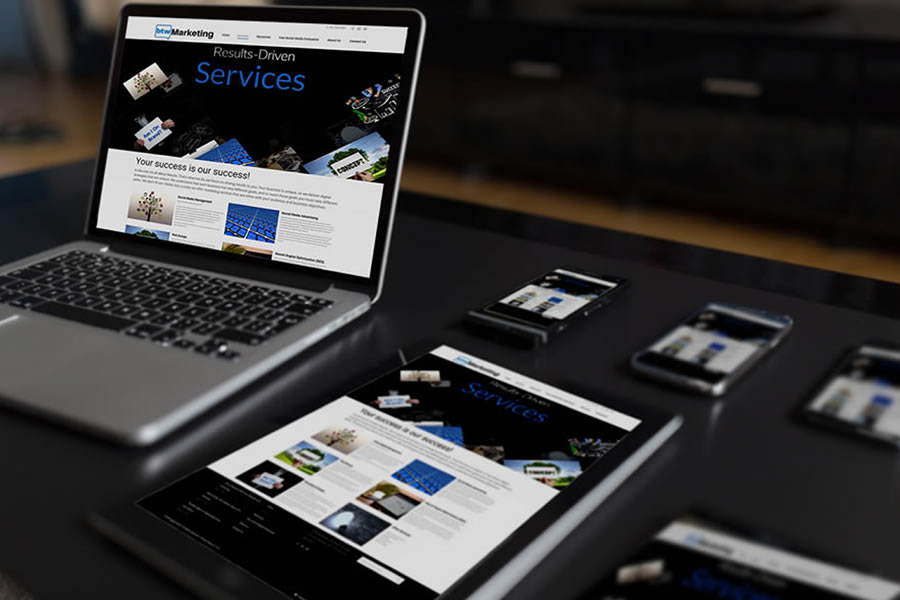
The future is mobile. The chances of you looking at this article right now on a mobile device are very high. There was an estimated 211 million mobile phone search users in the United States in 2020 [1]. This number is only increasing. More and more consumers find themselves doing a lot of their buying research and buying on their favorite mobile devices. Because of this, it's essential to have your website updated to be mobile responsive and not just mobile-friendly. Mobile-friendly sites are generally sites that shrink down to make things easier to see. A mobile responsive website is one that is completely reformatted to produce a scaled-down version of what you experience on the desktop site. Essentially, it provides the exact same experience but on a mobile device. Still not convinced your site needs to be mobile responsive? Here are the top 5 reasons to change your mind.
5 Reasons Your Website Needs To Be Mobile Responsive:
1. Over 50% Of Searches Come From Mobile Devices According to Google, over 50% of all search queries globally come from mobile devices [2]. This is a staggering number. This means mobile searches exceed that of desktop searches. If your website isn't mobile responsive, you are missing out on a large (and growing) segment of the marketplace. These users will not have a good viewing or navigation experience if they do not have a website that scales. Mobile devices have smaller screens and different aspect ratios. Your website needs to scale appropriately to provide a better viewing and navigation experience.
2. You Won't Rank Well Believe it or not, your website not being mobile responsive means your website isn't going to rank well. Google has been emphasizing the importance of mobile responsiveness because they are well aware that it's taking over. Google wants its userbase to have a good experience. Thus, they want to reward any website that scales properly to mobile devices. They don't want to send valuable search traffic to websites that are going to provide an unoptimized viewing or navigation experience. As a result, your ranking will directly suffer as a result of having a non-responsive site.
3. Your Bounce Rate Will Be Lower One of the main things you want to do when you are looking to improve your site is to lower your bounce rate. Why spend all of that money, time, and resources getting people to your site only to have them bounce off it? The best way to lower your bounce rate is by optimizing your site for everyone that visits it. Your site needs to be responsive to effectively scale and provide a better overall mobile viewing experience.
4. Better Conversions One of the biggest issues with having a poorly optimized site for mobile devices is the fact that your conversions will take a hit. Maximizing your conversions is important. You want your website to generate leads or even sales for your business. If your website isn't scaling properly or loading fast enough on mobile devices, you won't get high conversions. People will have a difficult time figuring out where to click or they may not even see your Call-To-Action (CTA). Regardless of the reason, your conversions will suffer without a responsive site.
5. Your Site Will Be Slow Having a fast-loading website is crucial to providing a good viewing experience. No one is going to wait around for pictures to load to experience your site. Having a responsive site ensures that everything is adjusted for mobile devices. Not only are the picture sizes adjusted, but the entire backend is reformatted to ensure everything loads quicker with underpowered devices.
Worried about not being able to turn your website into one that is mobile responsive? No need to fret. A professional marketing agency with mobile design experience can get your website optimized for the mobile future in little time.
References:
[1] https://www.statista.com/topics/2479/mobile-search/#topicHeader__wrapper
[2] https://searchengineland.com/report-nearly-60-percent-searches-now-mobile-devices-255025
Please ensure Javascript is enabled for purposes of website accessibility